Expedia Group – Unified Partner Onboarding
We’re building a new, single B2B application that will replace the many existing ways for partners to sell their products on Expedia Group sites. Expedia Group is a travel company which sells products including flights, hotel rooms, vacation rentals, experiences, rental cars & more to travelers around the world. As a two-sided marketplace, Expedia is also responsible for collecting and listing these products from individuals and companies in 140 countries. These Expedia “partners” are crucial to the business – a good supply of high-quality listings is what allows Expedia Group to be successful. Simply put, Unified Partner Onboarding is an effort to allow all of our diverse partners to join Expedia and list their many disparate products with a single, adaptive experience. Background Many people know of Expedia.com as a place to buy plane tickets, but the scope of the business is much broader than plane tickets alone. Expedia Group sites offer hotel rooms, vacation rentals, experiences, rental cars, cruises – the list goes on and on. In addition to this large product portfolio, Expedia Group is also a collection of brands including Expedia.com, Hotels.com, Vrbo, Travelocity, Trivago, Egencia, any many more. When I started at EG, any partner listing […]
Read More ›

Inklusive
Inklusive is a tool that aims to equalize participation & minimize stress in meetings by changing the basic rules of a meeting and empowering everyone to participate. Inklusive is a passion project I’ve been building with my friend, Jonno Schmidt. I devised the idea for Inklusive in 2019, while working on Microsoft Whiteboard. During my time at Microsoft, I worked with a diverse set of co-workers, some of whom enjoyed meetings and others who absolutely loathed them. Observing the differences between these people and how they operated in meetings, I learned that typical meetings favored the most outspoken participants. And unfortunately, many of the quieter members of the meeting were simply encouraged to “speak up” to have their ideas heard, which is often much easier said than done. I wondered – instead of encouraging introverts to change their behavior, maybe the problem is with the way we typically host meetings. Perhaps changing the way a meeting operates could help everyone in attendance feel like they have an equal seat at the table. Inklusive is the result of these explorations. More than just a tool, Inklusive represents a new type of meeting that’s designed to be more equitable. It gives all […]
Read More ›

Microsoft Whiteboard – overview
I served as a Senior Designer and lead on the Product Design team for Microsoft Whiteboard from 2016-2019. I also served as a manager on the team during 2019. Product concept In mid 2015, I was part of a small team of OneNote folks asked to envision, build, and test a new type of product for Microsoft, designed to be used primarily on Surface Hub for multi-input collaboration. Needless to say, this was a seriously exciting opportunity – it’s not every day that you’re asked to help build a completely new productivity app for Microsoft. Some initial ethnographic research had been done before the project kicked off, and we knew that there was a gap for meeting collaboration around freeform input, particularly for remote participants. Physical whiteboards were (and continue to be) essential for lots of types of in-person collaboration, but there wasn’t a good digital equivalent that could allow remote participants to join in. And physical whiteboards have lots of limitations – they can’t be shared and are restricted to drawings. A digital evolution of this medium could allow a new level of collaboration for IWs, classrooms, and even home users. Opportunity statement Collaboration during meetings can be difficult […]
Read More ›

Microsoft Whiteboard collaboration experience
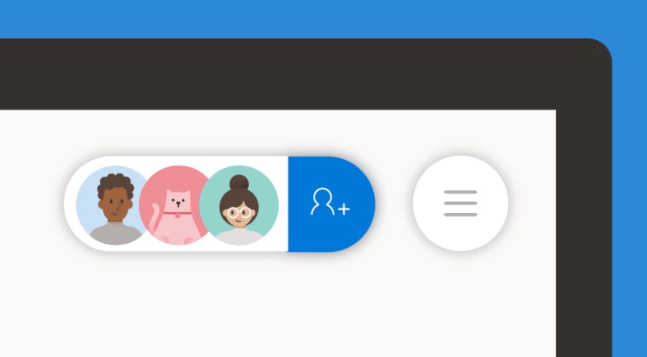
Microsoft Whiteboard is a real-time collaborative, free-form canvas that I helped create. This is a vignette of one of Whiteboard’s major components. For more information on Whiteboard as a whole, as well as other major aspects that I designed, see my Whiteboard overview page. It was challenging to build a collaboration experience for a brand new product. It was core to our value prop and had to work for all platforms, screen sizes, and types of users. We knew from the inception of the product that we wanted Microsoft Whiteboard to be inherently collaborative. “Collaboration first” was the first design principle and the Surface Hub (where many users would first be introduced to Whiteboard) was a device aimed at making teams work together more effectively. While the engineering team was working on building out the real-time sync engine, I was busy designing the “people picker” & “claim board” experiences as well as storage and user permissions model. My role I was a design lead and manager on the Whiteboard team. For this product area, I was the designer of the sharing UX including the invite flow and messaging, claim board experience for Surface Hub, as well as permissions, and storage. […]
Read More ›

OneNote for Windows 10 redesign
In 2015, Microsoft was gearing up to release Windows 10. The OneNote for Windows team simultaneously set out to build the best app on the new platform. We’d completely overhaul OneNote and set it on a new track for the next 5 years. Early on at Microsoft, I worked on many aspects and features of OneNote, but in 2014, I took over most of the design responsibilities for the OneNote “Metro” app from another team. The “Metro” app was an experiment to see what a Windows 8 app – designed specifically for use with touch on Windows 8 tablets – might look like. The result was a slimmed down notetaking client that lacked the majority of OneNote’s pre-existing features. Around 2014, the team responsible for the Metro app was dissolved and my team took over ownership of the app. With the upcoming release of Windows 10, Microsoft announced its new UWP platform – a way for developers to build a single application that would work on any Windows device from a small phone to a huge interactive display. And these applications would support a variety of inputs including mouse, keyboard, touch, and pen. OneNote for Windows set out to be […]
Read More ›

BXT & design team work planning
About BXT In late 2014, I was introduced to the concept of “BXT” – it formalized the three pillars of product development in my organization at Microsoft: It basically boils down to having three groups of workers in your organization: Product Management, Design, and Engineering. Each is responsible for upholding 1 of the 3 pillars necessary to create a successful product. These three teams were already somewhat in place in our organization, but there was an effort to more formalize these roles and their deliverables. At a company like Microsoft where technology has historically trumped user experience design, having a formalized framework that considered them equal considerably improved the overall quality of the software we were building. The Product Management team set out to define our customers’ business needs and wants as problems. The Design team’s job was to come up with solutions to these problems. The Engineering team was to find creative and efficient ways of implementing these solutions. And of course, there’s some overlap between these – a designer can help a product manager better define the problem or provide an engineer with several proposed solutions to find one that’s most cost effective. The lifecycle of a BXT […]
Read More ›

