
We’re building a new, single B2B application that will replace the many existing ways for partners to sell their products on Expedia Group sites.
Expedia Group is a travel company which sells products including flights, hotel rooms, vacation rentals, experiences, rental cars & more to travelers around the world. As a two-sided marketplace, Expedia is also responsible for collecting and listing these products from individuals and companies in 140 countries. These Expedia “partners” are crucial to the business – a good supply of high-quality listings is what allows Expedia Group to be successful. Simply put, Unified Partner Onboarding is an effort to allow all of our diverse partners to join Expedia and list their many disparate products with a single, adaptive experience.
Background
Many people know of Expedia.com as a place to buy plane tickets, but the scope of the business is much broader than plane tickets alone. Expedia Group sites offer hotel rooms, vacation rentals, experiences, rental cars, cruises – the list goes on and on. In addition to this large product portfolio, Expedia Group is also a collection of brands including Expedia.com, Hotels.com, Vrbo, Travelocity, Trivago, Egencia, any many more.
When I started at EG, any partner listing any product required starting from one of these many brand sites. The vast majority of these partners would need to spend several hours directly working with an EG employee to get their listing created and live.
I joined EG with the goal of identifying and exploring opportunities to make the partner journey easier. Addressing the pain points of “onboarding” new partners and getting their listings live was my #1 priority.
Just some of the brands operated by Expedia Group. Most provide different ways for partners to onboard and list their products.
The problem
- EG currently has many disparate onboarding experiences for many different products, partner types, and marketplaces
- Partners currently need to spend a huge amount of time with an EG employee to craft their product listings
- Different partner types have vastly different needs
- 140 countries around world all with different needs, expectations, and regional requirements
Project goals
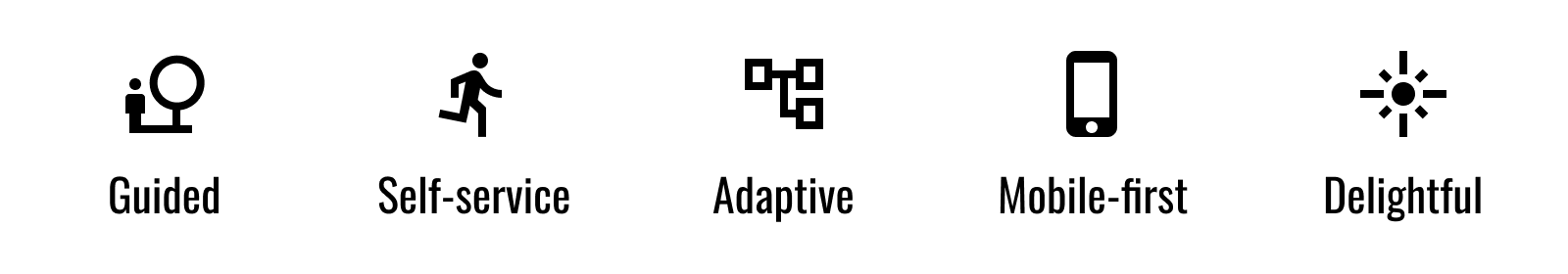
Some of our top tenets for the project
User goals
- Design a single, guided workflow that is simple and easy to use for all partners
- Allow partners to self-serve list their properties and go live, removing the need to spend hours on the phone with an EG market manager
- Build an adaptive workflow that changes to meet the needs of different product types, partners, and regions
- Optimize the workflow for our growing userbase on mobile devices
- Add some delight to what can be, in some cases, a tiresome process
Business goals
- MVP: To limit scope, focus first on highest potential product category with the most partner impact: lodging (hotels and vacation rentals)
- Accelerate acquisition by maximizing self-service potential for most partners, reserving white-glove service for highest ROI partners
- Ensure listings are complete and of high quality, building a healthier product marketplace
- vNext: Extend the experience to other product types including car rentals, experiences, and flights
My role
Initially, I was one of two designers working on blue-sky explorations for this project. Eventually, the team grew to 6 designers, 2 content strategists, and 1 researcher. Throughout, I acted as project lead.
I wore many different hats for this project, depending on the stage. Early on, I served as information architect & UX designer. Later, my role expanded to also include functional prototype engineer & project manager.
Project stages
Unified Partner Onboarding started as an exploratory IA project and has since evolved into a large-scale engineering project for Expedia Group. Below are the distinct stages of this project:
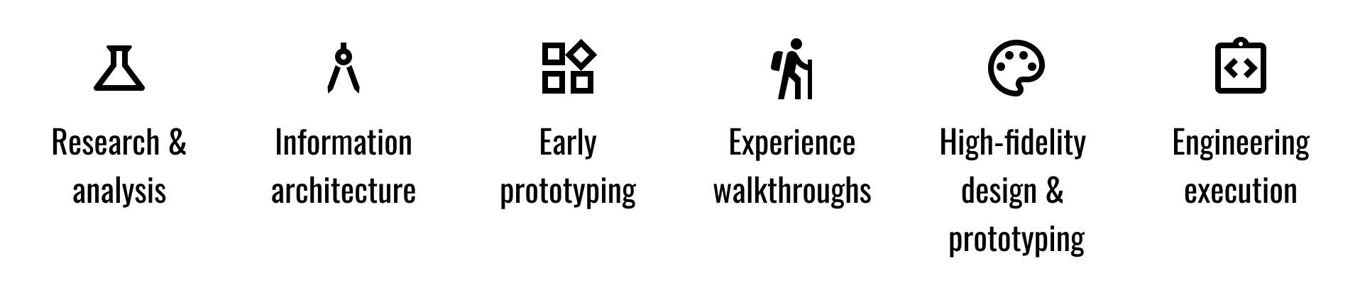
Stages of the Unified Partner Onboarding project
Research and analysis
A lot of the necessary ethnographic research for this project was done by the talented EG research org before I arrived at the company. A co-worker and I used this pre-existing research to understand the needs of our customers and gain clarity on the different goals of the different partner segments – hotel operators have vastly different needs than vacation rental owners.
We also took this opportunity to understand the existing experience. Different partner types were routed down completely different paths, resulting in a host of disparate and confusing experiences:
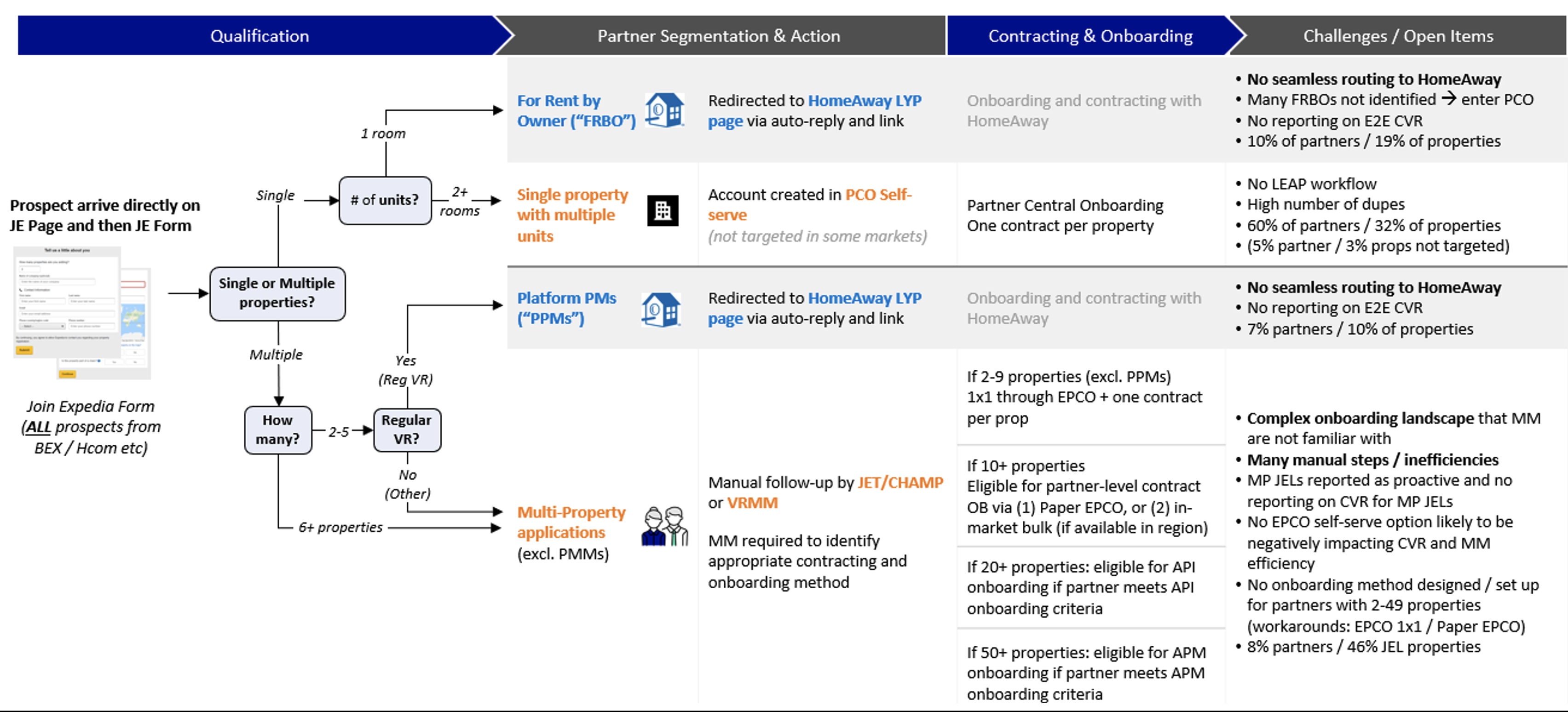
The existing (and complicated) EG lodging partner flows.
Another key job here was to synthesize the pain points our customers currently experienced and identify top user needs. Here you’ll see one example of that synthesis – identifying the major missed requirements of two of our existing Onboarding experiences against those of the two other major players:
Analysis of our existing platform capabilities/customer requirements against those of the other top players.
With this input, we synthesized an ideal, conjoined user flow for a lodging partner, covering all of the main Jobs to be Done. The flow would evolve and change over the next steps of the project, but with this, we had a good starting point.
The ideal, expected journey for a new lodging partner.
Information architecture
Once we had a good handle on the research, our next step was to start mapping out specific user journeys for different partner types and property types, trying to find commonalities between them.
An example of one ideal partner flow: a Cabin owner. Click the image to view it at full-size.
This process took a lot of whiteboarding and diagramming, most of which took place in a conference area for a few weeks. The exercise alone was critical to understanding the complexity of the different possible flows, but we also were left with a collection of [messy] whiteboards which would serve as the blueprint for our first stab at a single, adaptive flow.
The messy collection of whiteboards which would help us build our adaptive flow.
With some effort, we turned that collection of whiteboards into a single “master flowchart” representing a single end-to-end experience that could account for all of the requirements for the variety of partner/property combinations. This flowchart served as the basis for our work for the next several months. We printed it on a plotter and hung it on the walls of our office (… at least until quarantine began) and would refer to it on a daily basis.
It’s important to note here that there are forks in the flow that depend on a few major inputs from the partner. These forks depend on:
- Property type (e.g. hotel or house)
- Property subtype (e.g. aparthotel, cabin, bed & breakfast, ryokan)
- Number of properties (some partners wish to list many bookable units)
- Location/local regulation
The “master flowchart” representing a combined look at all different user journeys and the commonalities between them. Colored arrows represent specific property types. Dotted line connectors represent common components in separate places. Shaded areas represent component areas that would need to adapt depending on previous selections by the partner. Click the image to view it at full-size.
The completion of this work made us realize that this flow was just one piece of the puzzle – in order for it to be useful to our partners, we’d need to hide most of that complexity and only surface the useful information at any given time. This caused us to start exploring the “UX layers” of the experience, including some aspects of what the end user would actually see.
The proposed “UX layers” of the project.
We’d settled on our adaptive decision tree and how that layer could serve as the logic for the modules we’d serve up to a partner. On top of this were:
- Orchestration layer, determining which pieces were needed or missing at any given time
- UX framework, displaying the content in a useful and easy-to-understand way
- User experience & interactivity, determining how the pieces appear and change as the partner progressed through the flow
- Content strategy, the help, tips, and content that would help the partner achieve success
Each of these layers had a deliverable of some sort, shown below:
The deliverables associated with each UX layer.
With a decision on this set of deliverables, we set out on the early design and prototyping stage of the project.
Early prototyping
The next layer of the project called for us to brainstorm some UX frameworks – how we’d actually surface the relevant information on the screen. We took to drawing some wireframes of competing ideas.
A small sample of our UX framework explorations.
These explorations culminated in 2 competing frameworks, which we dubbed the “Conversational” and “Assistive” frameworks respectively. Each covered the main components we’d need to surface, but the “Conversational” framework reserved lots of real estate for guidance and tips, putting emphasis on helping the user every step of the way. The “Assistive” framework took a less in-your-face approach to guidance, instead putting emphasis on the content and relegating tips to a smaller area.
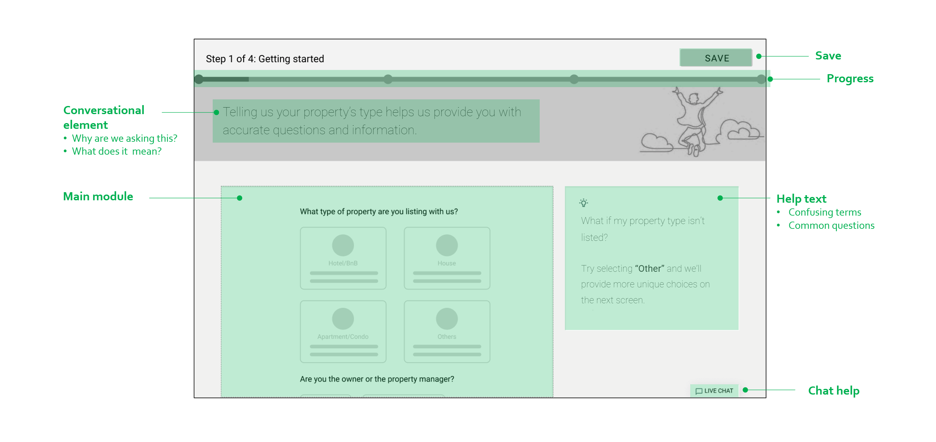
The “assistive” framework.
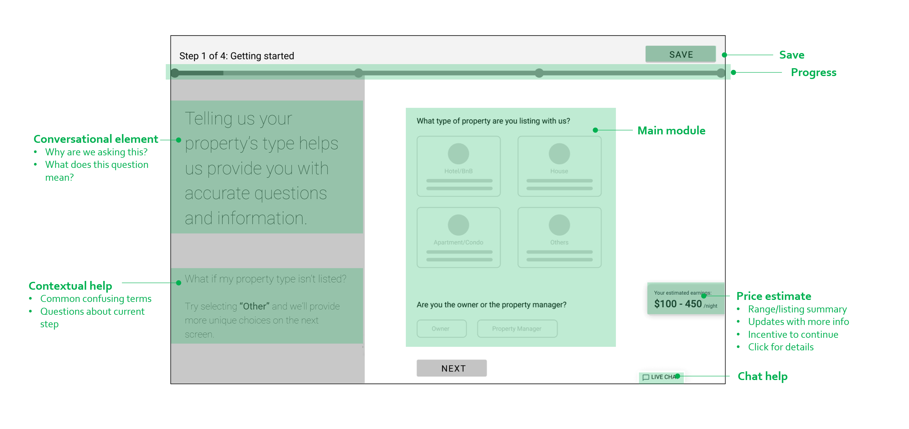
The “conversational” framework.
Both frameworks had a number of tenets in common:
- Focus only on 1 task per main module
- Use contextual content areas to provide helpful information relevant to the current step
- Show timeline indicator to increase confidence that the partner is making progress
- Allow Save as an escape hatch to continue at a later date
- Provide a way for partners to get help from a digital or human assistant
There were pros and cons to each of these frameworks, but without putting it in front of users, we weren’t sure which was the superior model. A content strategist helped us flesh out the details of these two frameworks, at which point I built the first working prototype of our work, combining all UX layers into an interactive experience. Something interactive could be used for experience walkthroughs and research, at which point we’d select a framework, iterate on the design, and step of the fidelity of the project.
I used Protopie, a tool I love for lightweight prototypes, to build this out. It allows for just enough code that I could program in the different branches of our adaptive tree, while still keeping things simple enough that I didn’t spend time on high-fidelity mockups
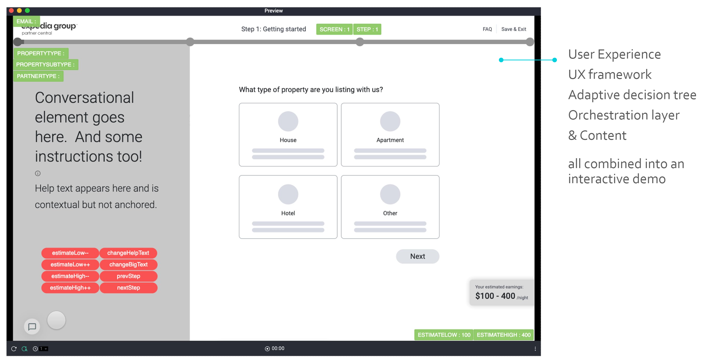
An overview of the Protopie prototype.
Here’s a recording of the prototype in action:
Experience walkthroughs
At this stage, the project received more attention within Expedia Group, and we were provided some research assistance to test our prototype internally (with other researchers, PMs, market managers) as well as externally (existing hotel and vacation rental partners). A series of experience walkthroughs let us learn more about specifically which decisions were working and which were not. The result of these walkthroughs was a set of action items for our next project stage.
A sample of some of the feedback received from our experience reviews.
Some feedback was specific, such as incorrect choices available in a particular model. Other feedback was more broad and overarching. In particular, we discovered that an initial hypothesis, that the “Conversational” UX framework would resonate better with partners, was wrong. Instead, we discovered that, while valuable, the huge conversational element was distracting partners from the main task at hand. Meanwhile, the “Assistive” framework provided the right balance of guidance and focus. We’d stick with this model for future iterations of our work.
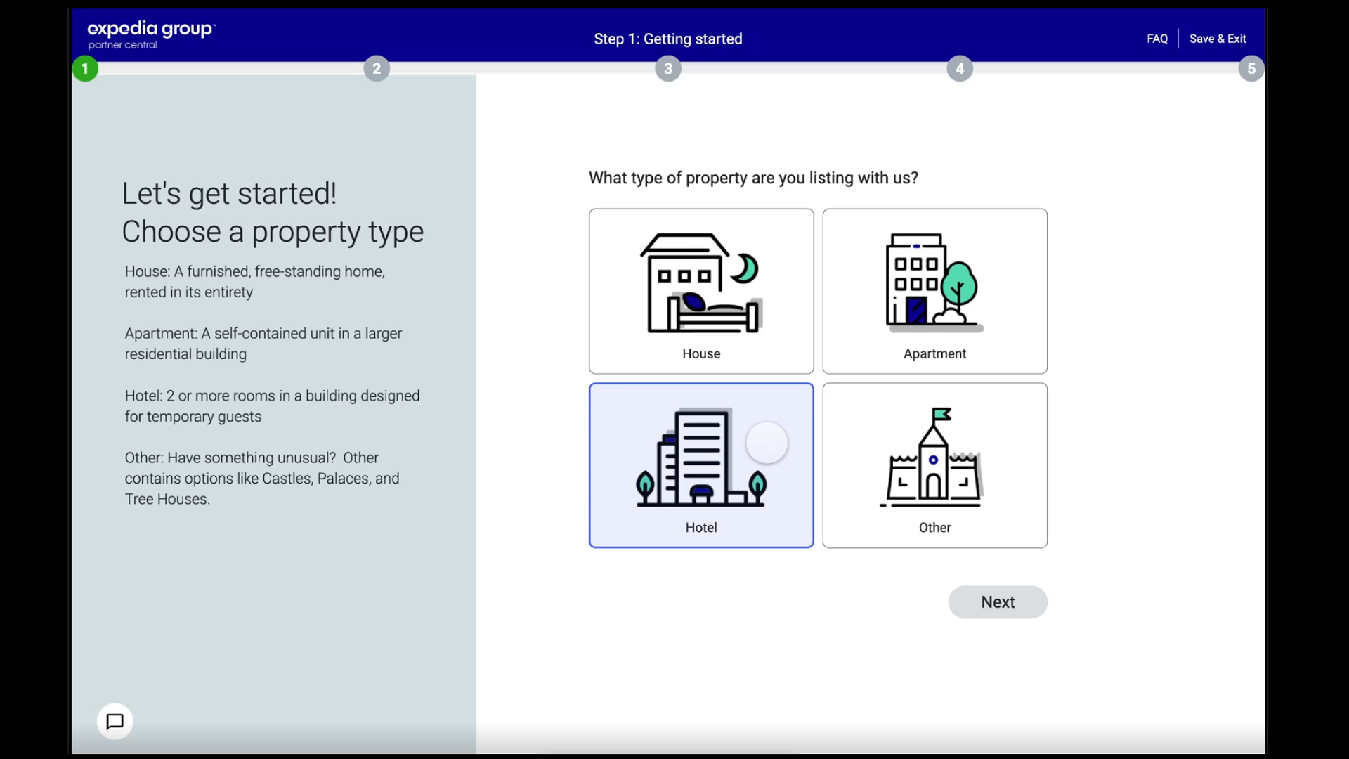
High-fidelity design & prototyping
At this stage, we had received enough feedback from research that we could refine our work and move to the next level of fidelity. We also received some additional funding – the team grew to 6 designers, 2 content strategists, and a dedicated researcher. I continued to focus on the overall app framework and high-level design, while other designers helped me dive deep into the multitude of specific modules that would constitute the majority of the main content area.
The design quickly moved from grey boxes to a colorful design more representative of the eventual final experience. Now our emphasis on both delight and mobile-first design became apparent. Here you’ll find several examples modules of the designed experience:
A few examples of the design mockups we’d use for the V2 Prototype. Click the image to view full size.
And here you’ll see how the framework, as well as some specific modules, were designed to adapt to work well on mobile devices:
Our design for uploading and assigning photos on small screen devices.
Our design for building room layouts on small screen devices.
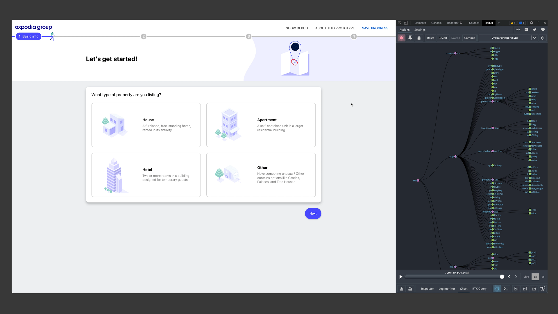
To collect this work into another interactive experience, I trashed the existing Protopie prototype and now focused on building a more fully-featured Reactjs + Redux app using the official EG component library. This was a fun opportunity to flex my engineering abilities, taking our dozens of Figma designs and actually building a fully-working adaptive experience. I can’t stress how proud I am of this artifact! This React prototype served as the basis for countless internal demos, usability studies, and further experience walkthroughs. We also handed this prototype to our engineering teams to use as the basis for the front end of the production-level app. It was also a chance to share my expertise with some members of the larger design organization who showed an interest in building more complex functional prototypes of their own.
Engineering execution (in progress)
This project is still underway but has moved from a mostly-design phase to an agile, iterative phase where we’re working with engineering to build out all of the major components in sprints. Along the way, we’re continuing to iterate based on quarterly research findings, feedback from engineering, and input from company leadership. I can’t currently talk about the public release date of Unified Partner Onboarding, but hopefully I’ll have more to share with you on this soon.
Currently, more of my time is spent on project management, helping the team deliver updated modules on-time so we can meet engineering deadlines. For more information on how I like to manage my design team efforts, take a look at my blog post on BXT process.
Next steps
As we approach our MVP ship date, we’ll be tracking some important metrics with the launch of Unified Partner Onboarding V1:
- Number of bookings received vs. previous Onboarding experiences: The #1 way to measure our success, is to measure our partners’ success. We have current measurements and expectations for what sales a new partner should expect to see after joining EG. With our new experience, if quality of listing and level of completeness go up, the number of bookings a partner will receive is expected to go up as well. Above all else, we can track this metric to ensure that our flow is working as expect.
- Frequency of self-service intervention: One of our main goals was to reduce the amount of time a partner needs to spend working directly with an EG employee to get their products listed. With our current design, the experience is completely self-service. We’ll be measuring how often a partner needs intervention from EG staff to complete Onboarding. Each of these cases will represent an oversight and potential improvement for the flow. We may be missing something or not asking the right question.
- Quality of listing: We can measure quality of a lodging listing based on specific completeness criteria, e.g. number of photos, detail of amenity selection, length of property description, and more. We’ll be watching these numbers to see how the self-service model fairs against EG’s previous methods.
- Time to complete: We have current measurements around how long it takes for partners to get from early “acquisition” to fully listed and, eventually, profitable. This time is currently quite long due to the frequent need for interaction from EG staff. Our expectation is that this metric will drop dramatically, from days/week to a few hours.
- Change in # of newly onboarded partners: The complexity of our old Onboarding flows means that many partners leave our funnel without ever finishing Onboarding. We can simply measure how many partners have onboarded to see if our unified flow is simpler and easier-to-use, resulting in more partners reaching the end of the acquisition funnel.
- Customer satisfaction: Finally, through surveys, we can measure how satisfied partners are with the overall experience. These are more subjective and require more analysis, but they’re nevertheless a valuable way to collect more detailed information about partner experiences than we can glean from hard metrics alone.
After a successful launch, there are a few of areas we’d like to attack next:
- Cover edge cases of lodging Onboarding
- Address additional product types including cruises, experiences, and rental cars
Challenges and learnings
Scope & level of detail
The scope of this project is perhaps the largest of any in my career. This post barely scratches the surface of how detailed our work in this area has really been. Even after scoping this project down to just focus on just the lodging segment, the level of complexity was extremely high. The sheer number of branches and different expectation across partner types, property types, and 140 regions resulted in lots of detail for our adaptive tree and content modules. And it was my responsibility to manage this complexity as the team grew and more folks joined the design and engineering efforts.
We’re still churning away on some of the edge cases while engineering is working in tandem. Some of these lesser use cases can be addressed p0st-MVP, but unlike many software projects I’ve worked on in the past, without many critical modules, listings won’t be complete enough to start producing revenue.
“Family of brands”
As I mentioned early in this post, Expedia Group has a large portfolio of brand sites. Many of our partners aren’t familiar with the portfolio – they may start on Vrbo.com and be surprised when the branding changes to Expedia Group. We’ve built out a system to allow for the branding on the Onboarding experience to adapt to wherever the partner starts their journey. But this adaptive branding adds lots of more complexity to the design system and layout. We’ve prioritized a few key brands for now, with more to come if necessary. This is an area where we can start small and grow over time – not 100% of acquisition traffic needs to make its way to Unified Partner Onboarding immediately. Instead, we plan to start with a smaller segment and cover all brands over time.
Reuse
One of the main surprises in this project was the level of reuse we were able to achieve across different forks of the flowchart. Initially, the expectation was that the needs of a vacation rental owner and a hotel manager would be quite similar, resulting in many common modules and synergistic experiences. What we discovered, as we dove deeper into individual customer journeys, is that the needs of different partner types are different enough that only about half of the needed modules would overlap. Luckily, with more project funding, we’re now getting good coverage on the plethora of modules required. By leveraging dynamic content, some of our modules adapt enough to ease this burden. For example, both hotels and vacation rentals require amenity information, and the applicable amenities choices can adapt based on property type (minibar vs. kitchen) or location (citylife vs. beachfront).
High quality vs. high speed
Something we constantly struggled with on this project was the level of completeness we’d like for new partner listings vs. the amount of time that required. It’s a subtle balance: asking for too much information can tire the partner and cause them to leave Onboarding before reaching the end; asking for too little might allow them to complete their listing with ease, but not be of high enough quality to result in lots of bookings. We addressed this balance by prioritizing the most critical information and allowing some fields to be addressed post-Onboarding, after their property starts producing revenue. We’re working with another team to ensure that the completeness of new partner listing improves over time – the journey doesn’t stop with Onboarding, it’s actually just the beginning.