In 2015, Microsoft was gearing up to release Windows 10. The OneNote for Windows team simultaneously set out to build the best app on the new platform. We’d completely overhaul OneNote and set it on a new track for the next 5 years.
Early on at Microsoft, I worked on many aspects and features of OneNote, but in 2014, I took over most of the design responsibilities for the OneNote “Metro” app from another team. The “Metro” app was an experiment to see what a Windows 8 app – designed specifically for use with touch on Windows 8 tablets – might look like. The result was a slimmed down notetaking client that lacked the majority of OneNote’s pre-existing features.
Around 2014, the team responsible for the Metro app was dissolved and my team took over ownership of the app.
With the upcoming release of Windows 10, Microsoft announced its new UWP platform – a way for developers to build a single application that would work on any Windows device from a small phone to a huge interactive display. And these applications would support a variety of inputs including mouse, keyboard, touch, and pen.
OneNote for Windows set out to be the best UWP app in the marketplace. We would flesh out the design to work on all device types and for all inputs.
We completely transformed the “Metro” version of OneNote into one of the best applications on the platform.
The team
This was my first major design project ownership at Microsoft. The number of designers working on OneNote for Windows 10 varied from 1-3, but I was consistently working on the project from 2014 until 2016.
Subprojects
The effort to redesign the app was broken into many categories:
- Navigation
- Phone UI/UX, Continuum, Scaling
- Recent Notes
- Drawing experience
- Page previews (for which I received US Patent 10,108,586)
- Commanding
For the purpose of this vignette, I am going to focus on the first three of these subprojects. I was the sole designer on these three subprojects.
Problem
Create a new app design for OneNote that balances simplicity for tablet/phone users and power for PC users. Support on a variety of device types and input methods.
Additional considerations
- OneNote Metro was designed to work for touch only, while OneNote for Windows 10 needed to work for audiences using mouse, keyboard, and pen in addition to just touch
- OneNote Metro targeted casual note-takers who didn’t need the complex navigation available in other versions of OneNote
- The brand identity and navigation UX of OneNote Metro was significantly different from the other clients
- Much of OneNote’s power comes from its availability on virtually all platforms, which is a hard sell when the clients don’t all work similarly
- Per the goals of UWP, the app would need to scale from 4 inch devices all the way up to 84 inch devices
- Our intended audience was huge: we would need to account for casual note-takers coming from Windows Phone to hardcore PC note-takers such as teachers, scientists, and information workers
Solution
- Choose the best aspects of the Metro client and the best aspects of the OneNote 2016 to build a simple yet powerful app
- Introduce some brand elements from other OneNote clients to bring this new project “into the family”
- Re-introduce navigation concepts that existing users expected to see, but modernize to work for touch and mobile devices
- Provide a framework for the app to grow (in functionality and design) over the next several years
Recent Notes
The goal of the “Recent Notes” feature was to introduce casual note-takers to OneNote without subjecting them to the more complex navigation features OneNote was known for. My hypothesis was that Recent Notes could serve as a good first introduction to OneNote; when users were ready and their list of notes had expanded, they could start to use Notebooks to organize their content more specifically.
My first Recent Notes clickable prototype
Recent Notes would organize your pages from all notebooks into a simple list sorted by from most recently edited to least recently edited. It would work particularly well for mobile devices that couldn’t fit multiple columns side-by-side simultaneously.
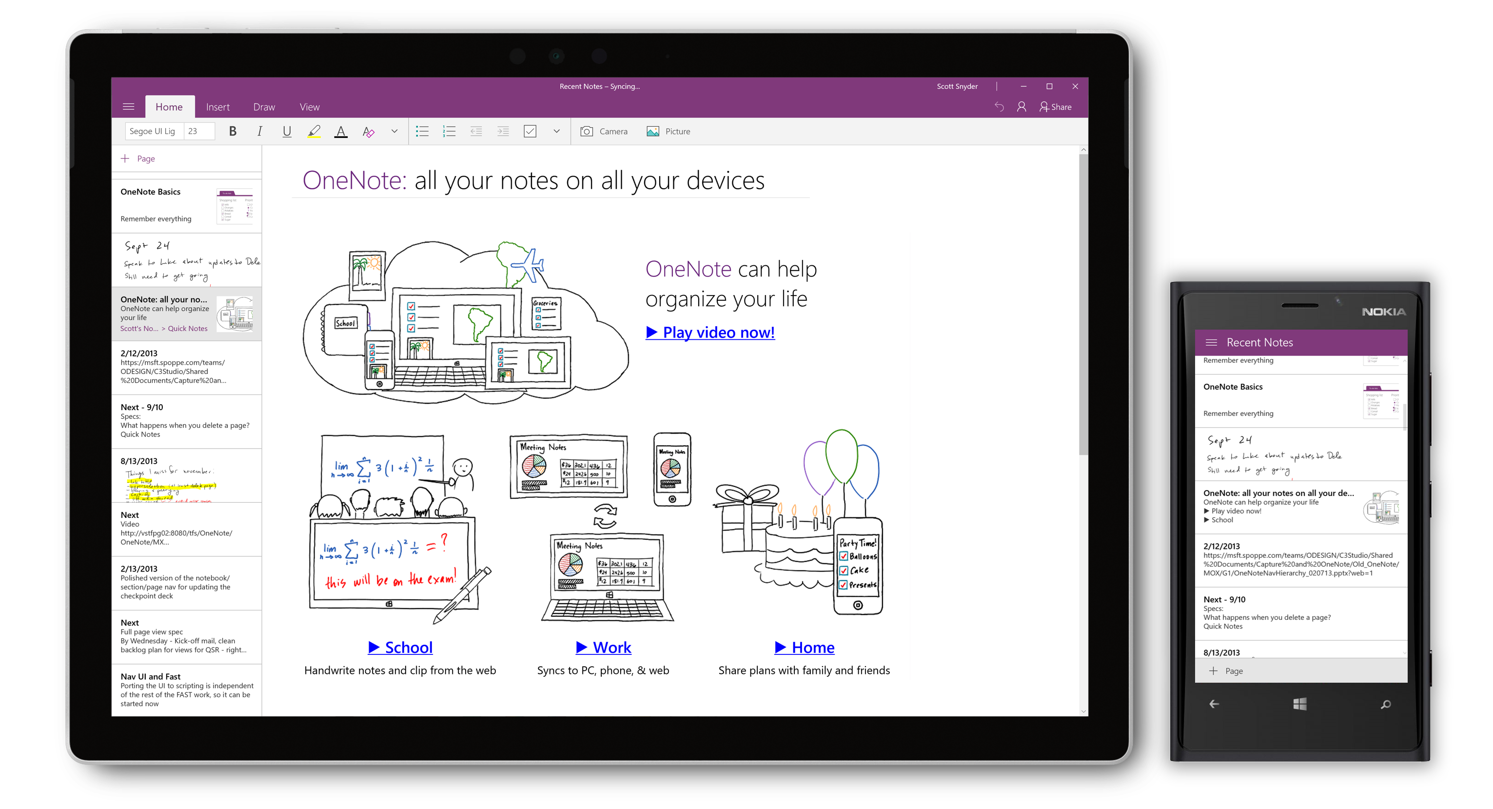
Recent Notes running on a Surface Pro and a Lumia
Navigation
Arguably the biggest design change of the whole project was the way we handled notebook navigation, the primary experience and value prop of OneNote. Here you can see an overview of these changes.
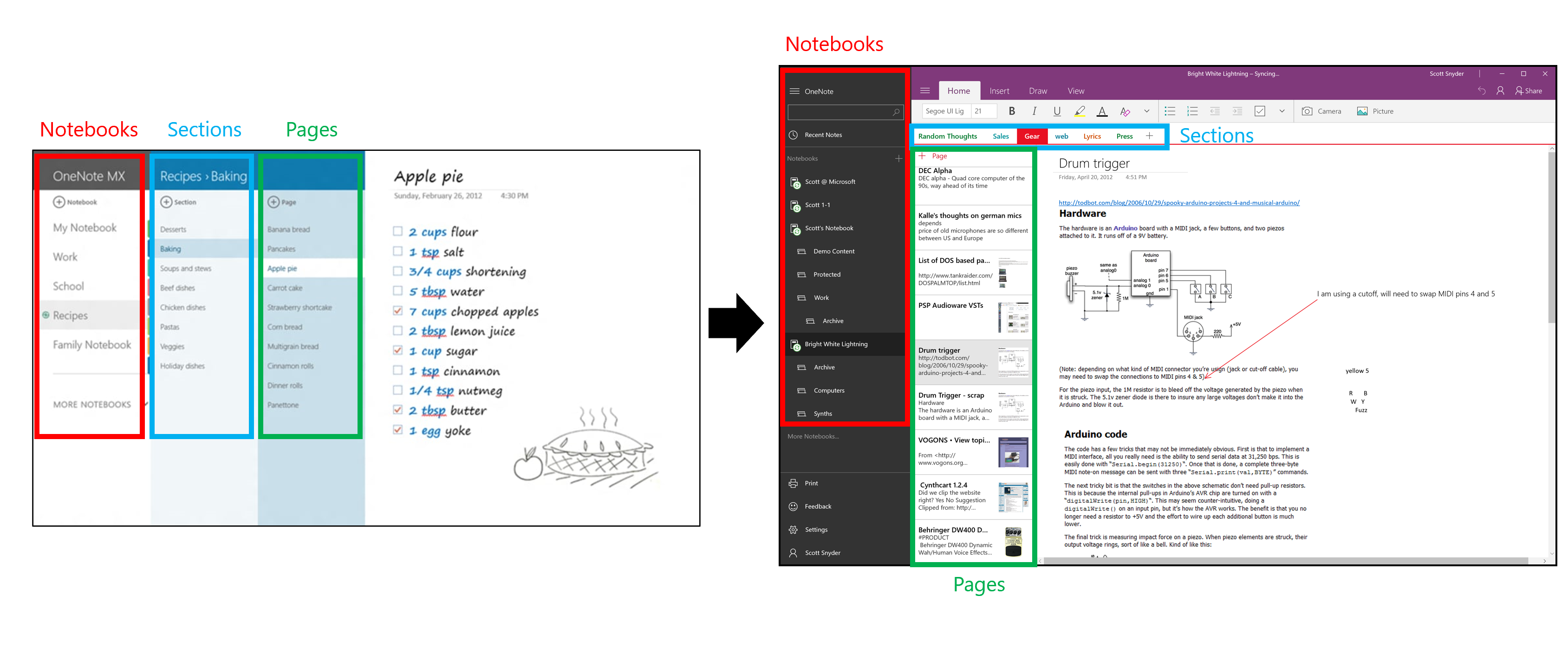
A look at the Notebook navigation changes of the redesign
These changes helped the app be more consistent with the UX of the other OneNote clients in the marketplace.
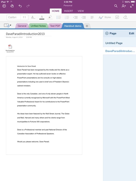
OneNote for Windows 10 now looked and worked more like the other OneNote clients including OneNote for iPad.
Since the left-hand pane could hide away, we could offer a good level of contextual awareness (keeping your section and page list in view) while retaining plenty of space for working.
Phone UI, Continuum, Scaling
The phone UI was completely rebuilt for Windows Phone 10. Tabs on top, page previews, Left-nav, Recent Notes and all other desktop features made their way onto the mobile version as well. A few things were changed in particular for phone:
- + Page primary action was always available for quick note-taking
- A Recent Notes shortcut was added to Notebook view for convenience
These were added with mobile note-taking in mind – when you need to quickly jot down something on your phone, access to a new note, or the last note you wrote, is of the utmost importance.
A look at the result of the design changes for Windows Phone on a Lumia 640.
As I mentioned earlier, I needed to ensure that the design was horizontally responsive, from 300px wide to 4k. Every element of the app has cutoff points where it starts to rearrange. At it’s smallest size on desktop, it’s just slightly wider than on Windows Phone. Just a bit less than 500px (the minimum window size for Windows 10 desktop) wide and the app completely changes to mobile mode.
The scaling behavior of the app.
And because of our attention to these scale points, we were able to achieve our goal of building one of the first Continuum-capable apps, allowing you to run the app in desktop mode by plugging into a large screen display.

OneNote for Windows 10 was one of the first apps ever to let you run the full desktop client from your mobile phone.
Additional considerations
As with all apps developed at Microsoft, I needed to consider:
- Screen reader support
- Keyboard accessibility
- RTL, localization, globalization
Prototyping
I made dozens of small prototypes along the way, testing minor navigation differences, UI elements on left vs. right, full screen mode, sizing of touch targets, and Recent Notes functionality, as well as other features not touched on in this post including Page Previews and commanding.
The majority of the changes I designed culminated in one large prototype seen here:
The prototype I built for user testing contained a huge amount of the features we hoped to build. It was extremely helpful for validation purposes.
I used this particular prototype for user testing with approximately 20 flash feedback participants over the course of a month, iterating slightly along the way.
Results
This was really a project combining old and new to create something better on the whole. I think we were really successful in revitalizing the Windows 8 design to look and feel like a more modern application with more powerful features, without sacrificing the simplicity that drew in many new users.
Challenges
Microsoft continued to develop two different clients for Windows throughout this process – OneNote for Windows 10 and OneNote 2016. Although OneNote 2016 didn’t see the introduction of nearly any new features (compared to dozens with OneNote for Windows 10), isn’t available in the Windows Store, and doesn’t run on Windows S or Windows Phone, it’s still available online and as part of the Office Suite. Customers clearly had lots of confusion over which version to use. There are countless blog posts about “which is the better version of OneNote.” Unfortunately, the product marketing communications about the two versions was never consistent or clear. In early 2019, Microsoft announced that OneNote for Windows 10 would continue to exist, but OneNote 2019 would not.
Success
Although specific metrics are under strict NDA at Microsoft, I can say that during my tenure on the OneNote team, the OneNote for Windows 10 client usage grew tenfold and went from the least used to the most used OneNote client in the product portfolio. It is also consistently one of the most popular apps in the Windows Store.
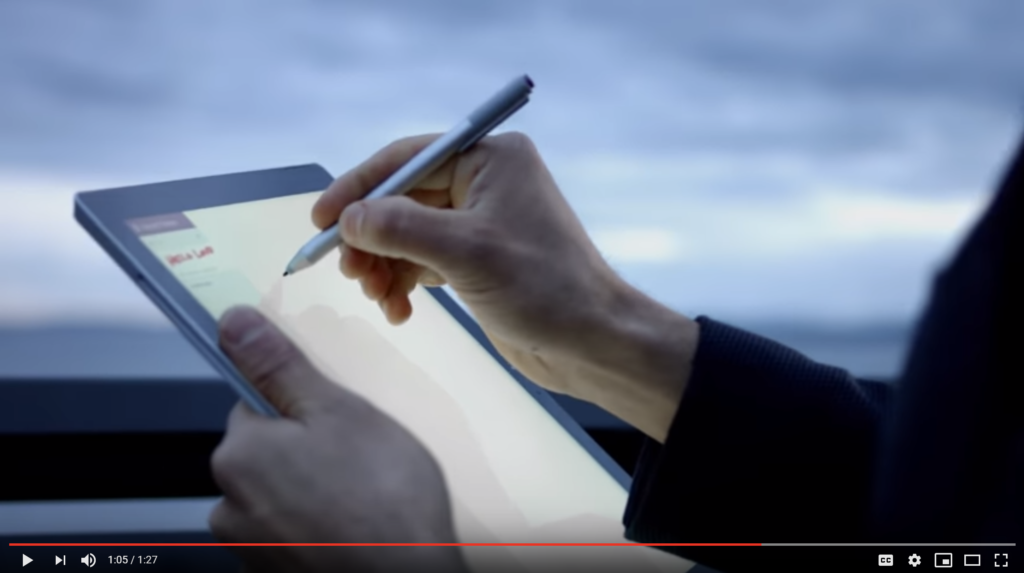
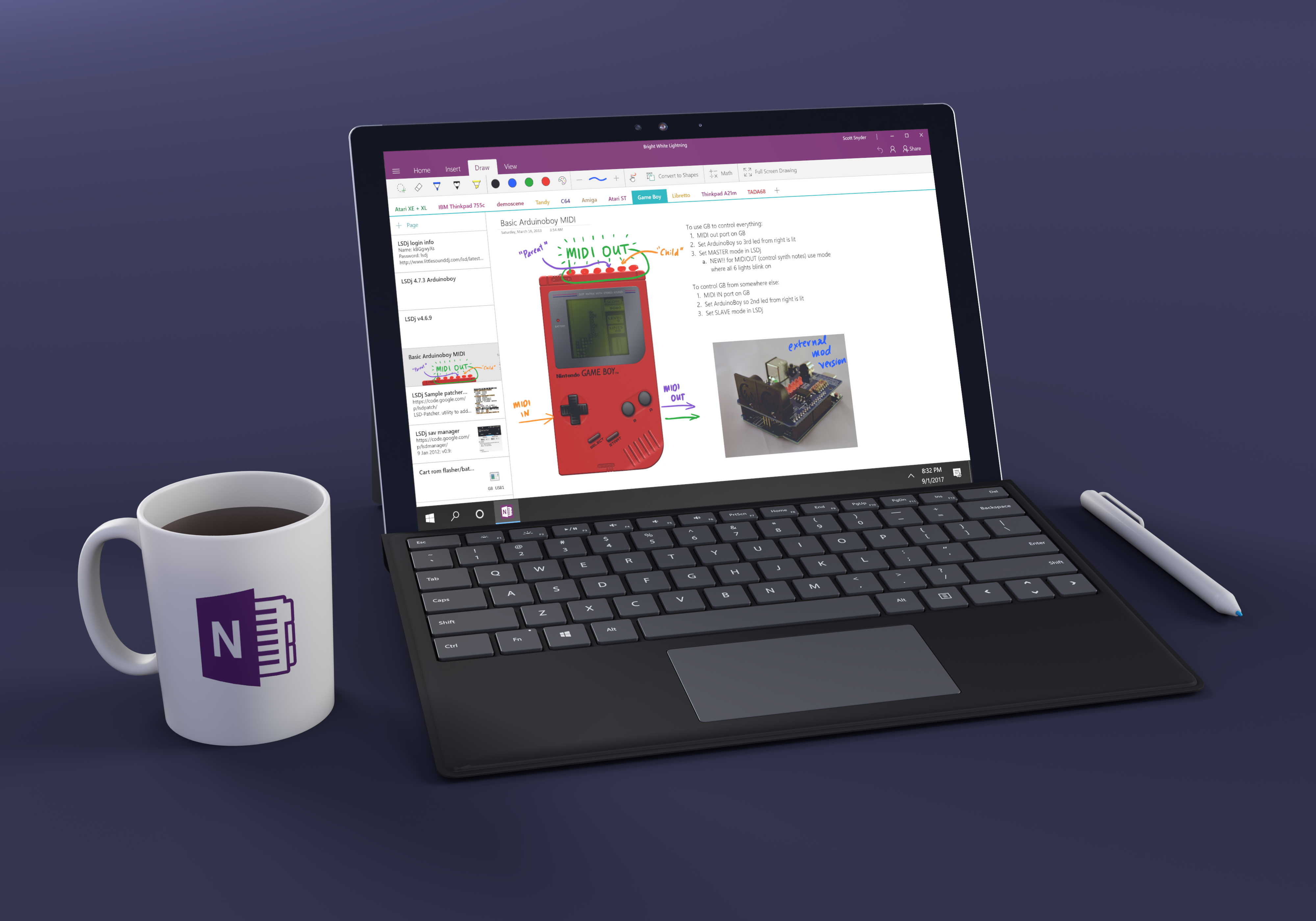
OneNote for Windows 10 featured in a Surface device commercial.
Following our work, Microsoft made the decision to ship OneNote on all new Windows 10 devices and was featured in countless commercials. In addition, the app store rating went from ~3 stars to 4.75 stars where it has remained since ~late 2016.
After our redesign, the OneNote app skyrocketed from a 3 star rating to a 4.75 star rating and has remained there since ~2016.
OneNote’s presence in education grew dramatically in the 2014-2019 timeframe. With many schools running Windows S on low-cost Windows tablets, OneNote for Windows 10 is the best app for the job. We hear from teachers worldwide that OneNote, Windows 10, and Surface devices have simplified how they do class/homework and have made their classrooms more engaging.
Recent Notes eventually made its way to all OneNote clients (Mac, iPhone, Android, etc) and remains highly used. We found that, as hoped, many users stay in Recent Notes until they really need to organize their work.
To this day, I don’t think another app has been able to accomplish what we did with respect to responsiveness and screen-scaling. OneNote for Windows 10 works on Windows Phones of all sizes and when connected to a larger screen via Continuum, shows desktop UI for screens up to 84″ inches large. Even Android and iOS struggle to do this today 4 years later.