Microsoft Whiteboard is a real-time collaborative, free-form canvas that I helped create. This is a vignette of one of Whiteboard’s major components. For more information on Whiteboard as a whole, as well as other major aspects that I designed, see my Whiteboard overview page.
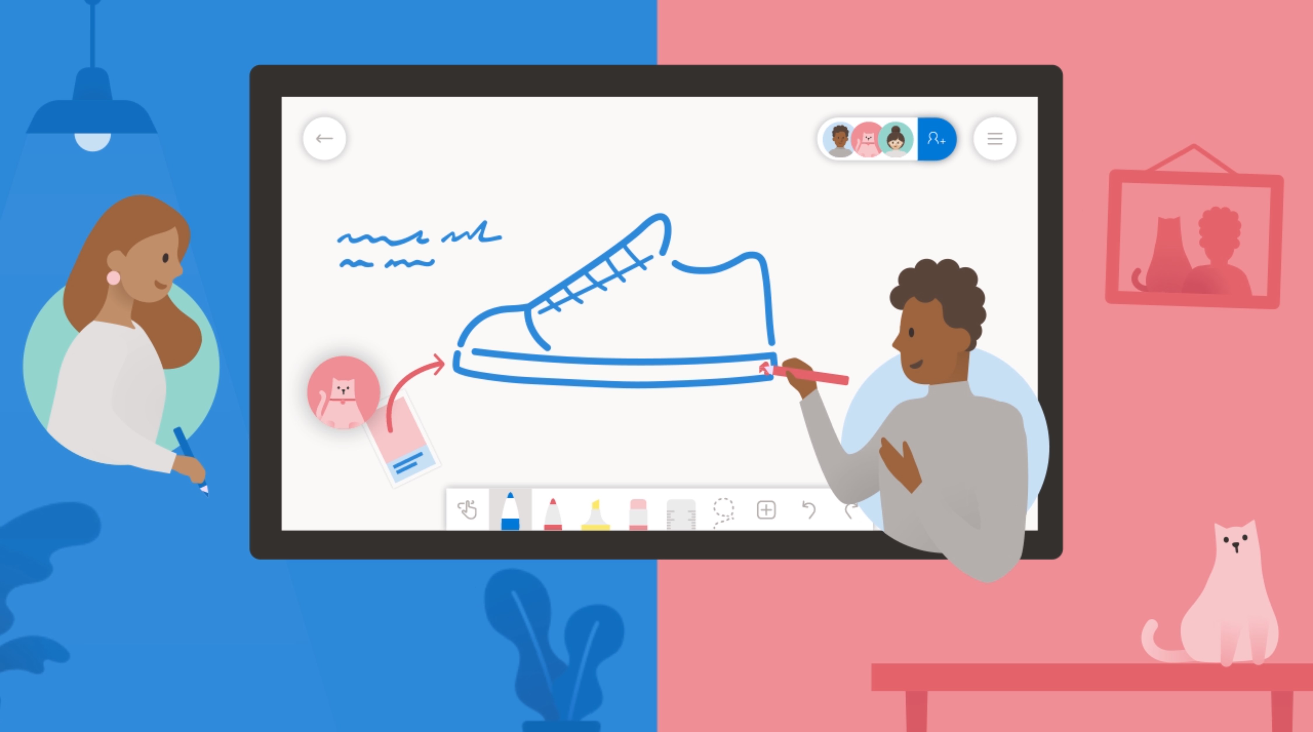
It was challenging to build a collaboration experience for a brand new product. It was core to our value prop and had to work for all platforms, screen sizes, and types of users.
We knew from the inception of the product that we wanted Microsoft Whiteboard to be inherently collaborative. “Collaboration first” was the first design principle and the Surface Hub (where many users would first be introduced to Whiteboard) was a device aimed at making teams work together more effectively.
While the engineering team was working on building out the real-time sync engine, I was busy designing the “people picker” & “claim board” experiences as well as storage and user permissions model.
My role
I was a design lead and manager on the Whiteboard team. For this product area, I was the designer of the sharing UX including the invite flow and messaging, claim board experience for Surface Hub, as well as permissions, and storage. For each of these efforts I was supported by a visual designer.
The problem
In order to encourage collaboration on Whiteboards, inviting others needs to be a simple, primary action.
Project tenets
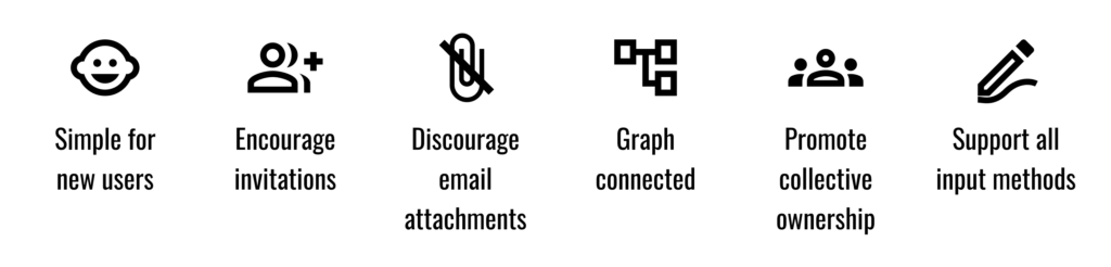
Key tenets of the project
Solution
Build a simple invitation flow that gets peers on the Whiteboard in as few steps as possible. Design for the most common use case (ad-hoc meeting in an enterprise setting) but also account for necessary variables such as anonymous access and custom user permissions.
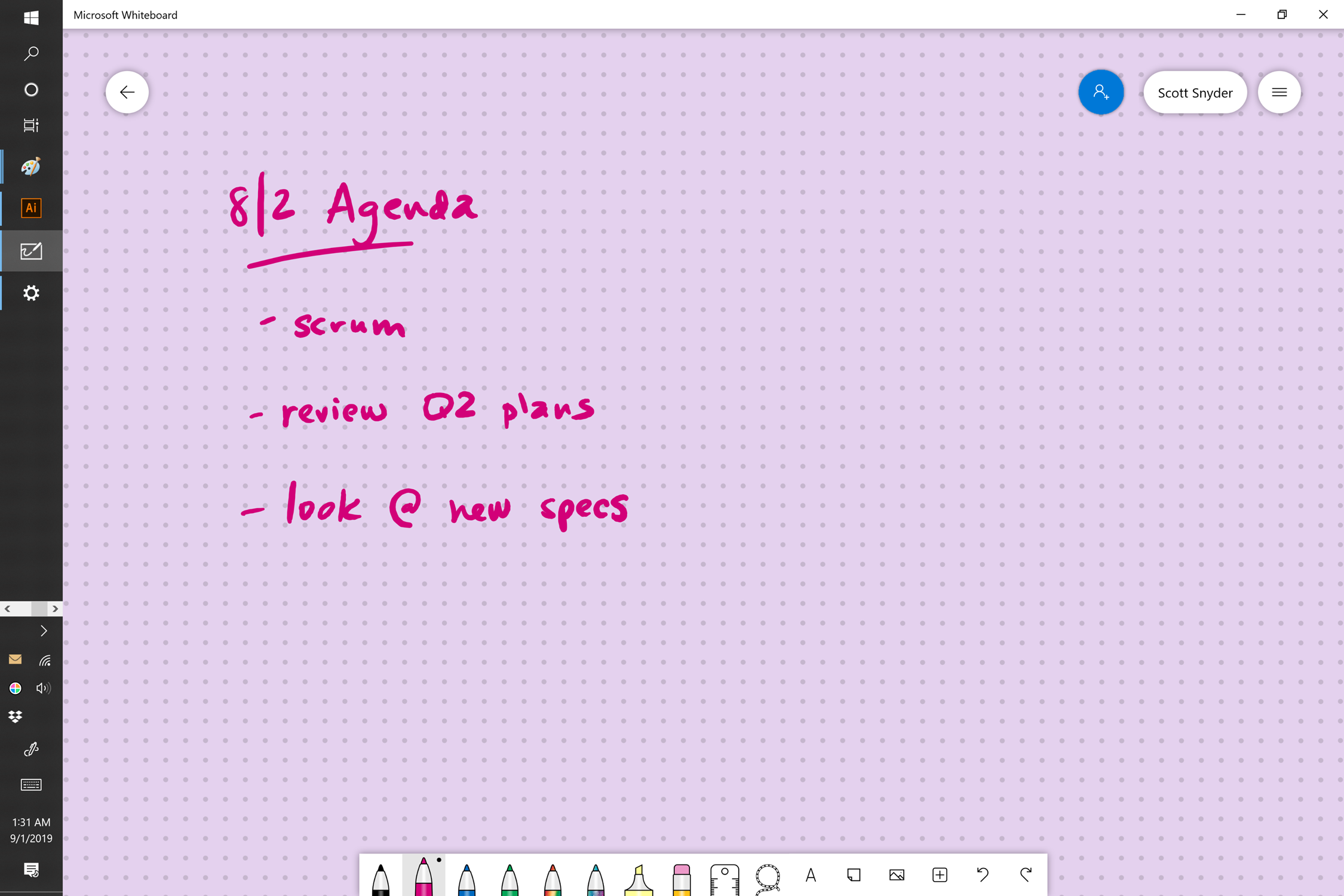
It’s almost this simple…
Early explorations
Early steps included mapping out a few versions of the flow as well as defining the types of shared sessions that would be common, user permission types, as well as ways to actually initiate sharing.
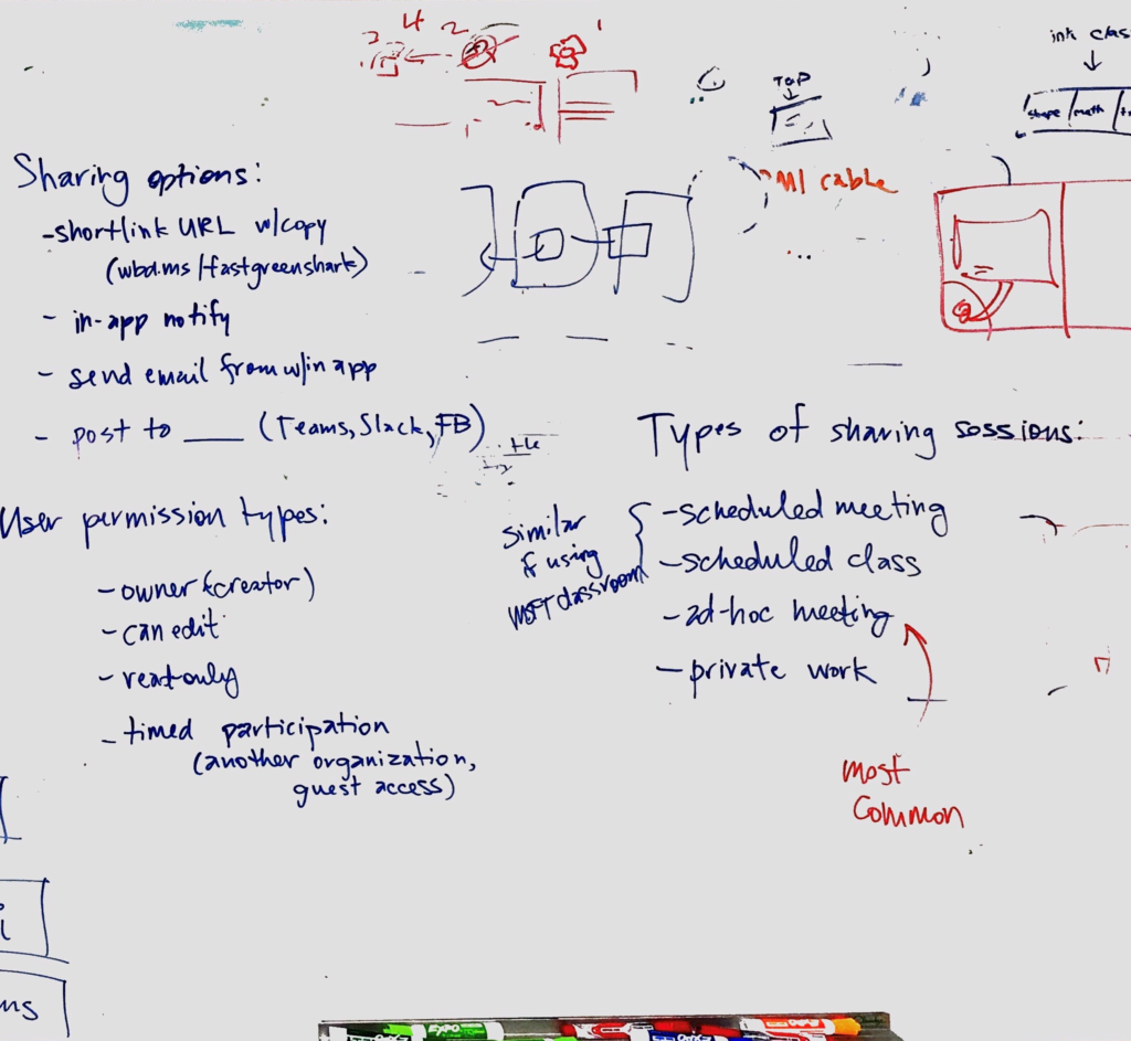
Whiteboard brainstorm of possible sharing options, user permission types, types of sharing sessions, and more.
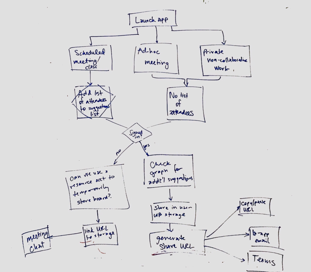
A quick exploration into what the flow might look like.
Other apps generally provide multiple options for sharing. Personally, I usually stick with the sharing URL.
I did some market research into how other products attempted to simplify the sharing process. Some ask users to enter email addresses, others try to search a directory for a match, but nearly all have a concept of a sharing URL. Anyone with access to this URL has access to the document. It’s a boilerplate option that isn’t fancy, but I expected it to be widely recognized. Users could simply take this URL and share it with co-workers using whatever tools they had available to them – Slack, Teams, or a Skype for Business chat window on a Surface Hub.
Once a user has redeemed this “golden ticket” sharing URL, the owner of the board has the opportunity to limit their access. Alternatively we could allow users to create two sharing URLs, one for edit permissions and another for read-only permissions. And the concept could be extended to snappable QR codes on large screens, allowing others in the room to consume the URL from far away and participate on their own devices.
My initial expectation was that users would be familiar with a sharing URL concept – it’s so common to see in Dropbox and other file sharing apps that I fully expected this to be a decent MVP. We wouldn’t need to build additional notification or messaging functionality because our customers could simply take the URL and paste it in whatever communication channel they typically use.
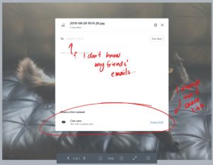
I also know in my personal life, when I’m presented with options of how to share, I always go for the URL and then send it via whatever channel works best for me. I never know my friends’ emails off the top of my head, so that option wouldn’t work for me when sharing photos or personal documents.
Prototyping
I built several prototypes for this project, each representing a different platform or design problem I was trying to test. Some of these prototypes were simple clickthroughs while others accounted for branching paths and required me writing a bit of code.
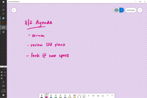
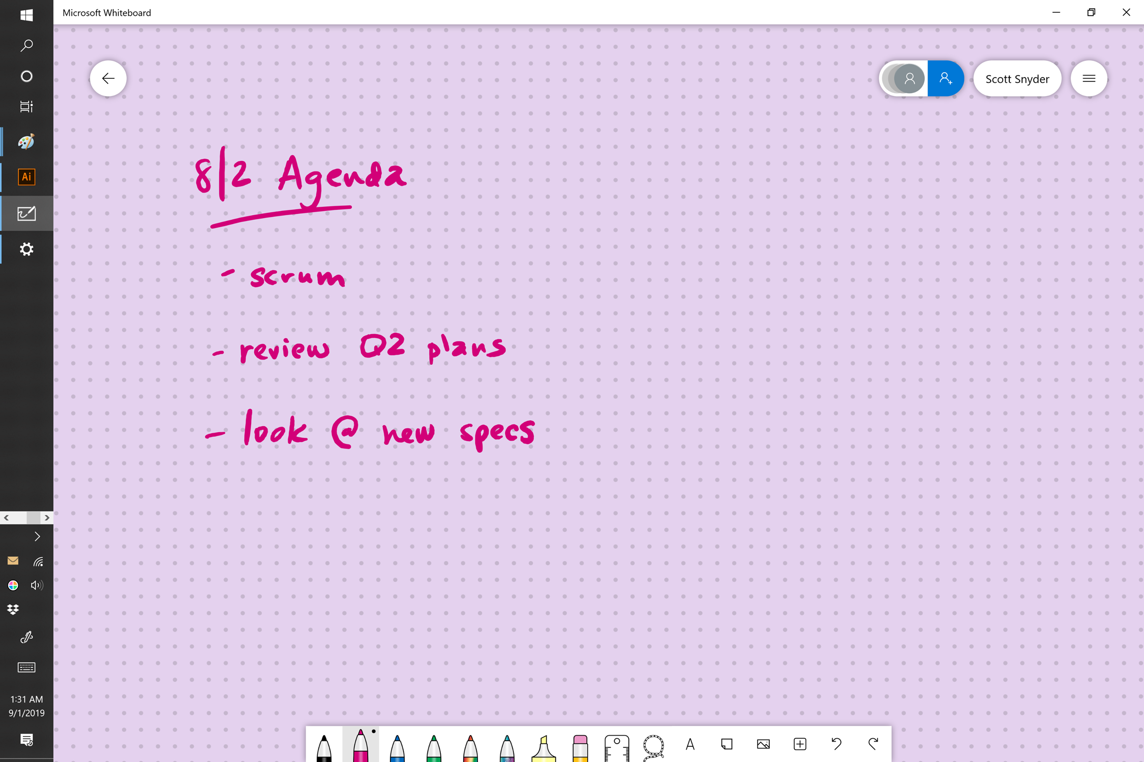
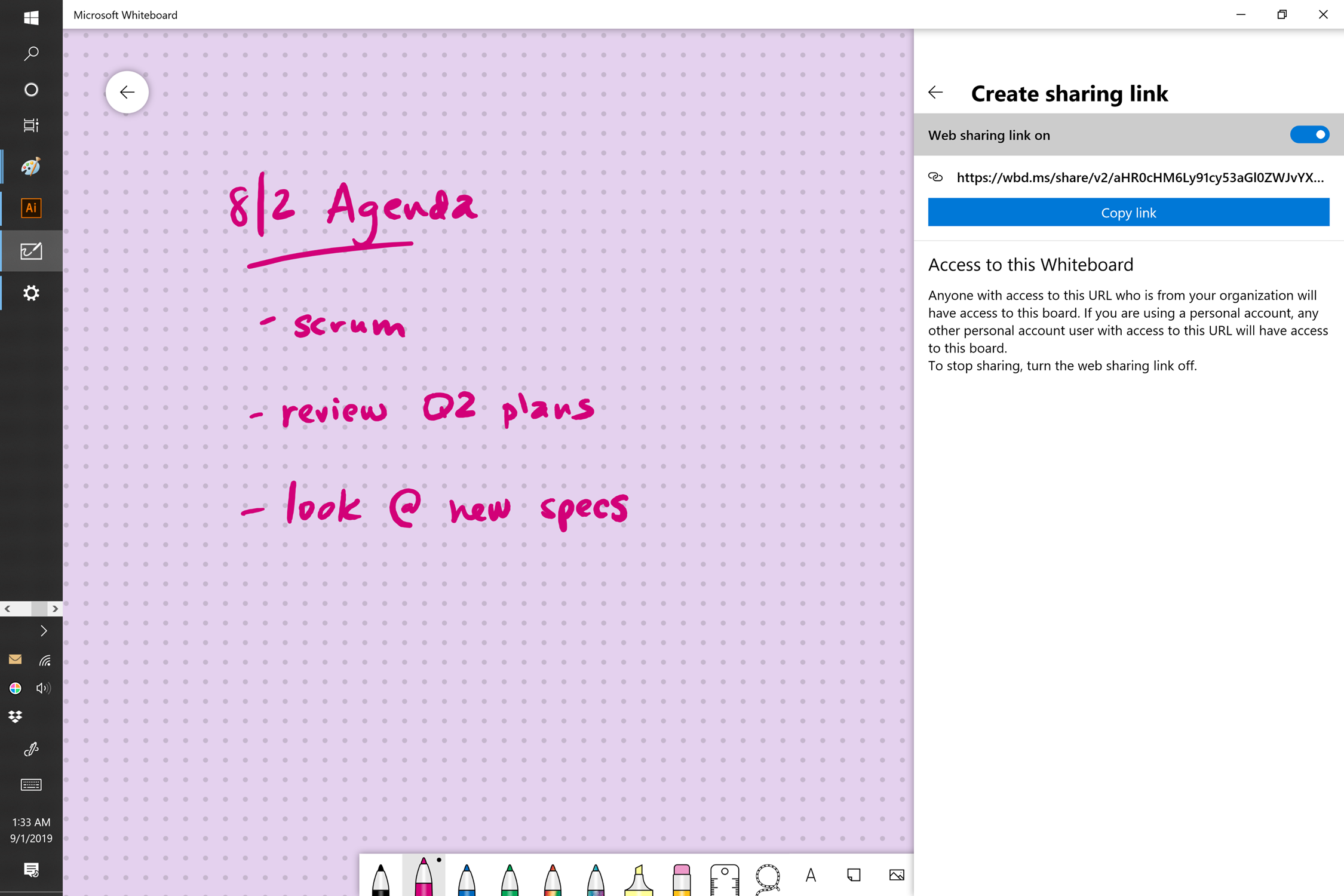
My first interactive prototype was the simplest version of the sharing URL concept that I could come up with. If this worked in early user testing, I’d develop it further.
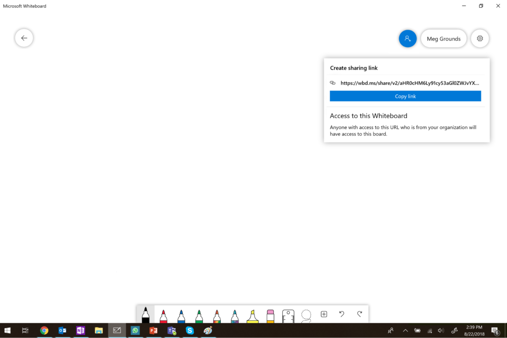
My first clickable prototype for the collaboration experience.
User testing
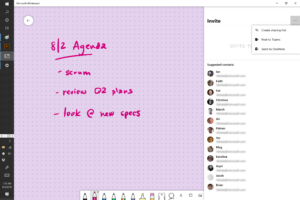
To my surprise, in the early rounds of user testing, the sharing URL concept failed miserably. Everyone was able to identify the blue “pawn” as the way to invite someone to the Whiteboard, but they didn’t understand the “Create sharing link” UI at all. The concept may be prevalent in other apps, but the users we tested with simply didn’t understand what the URL did or how it was being shared.
Many users thought they needed to visit this URL in their browser, where then they’d have the opportunity to complete the process. Others assumed that as soon as the URL had been generated, everyone they work with would somehow just get a notification that the board had been shared. A few simply didn’t know what they were looking at at all.
All in all, there was a lot of confusion. It was a good reminder that “we are not our customers” and what might seem like the right path to me really isn’t after a bit of testing with real customers.
I asked questions about the other types of sharing options I’d considered at the start of the project. There was a huge amount of feedback that users simply wanted type the name of the person they wanted to invite to the Whiteboard. I also got a lot of (expected) questions about why they couldn’t download the Whiteboard and attach it to email. I explained that they could still export the Whiteboard as an image and attach it, but they’d lose the ability to work with their peers in real-time.
Prototyping + user testing: round 2
Based on the feedback I received from the first round of user testing, I started to build additional prototypes for the variety of sharing options I’d discussed with the participants.
Because it was still needed for scenarios where we can’t search for users by name, I’d keep the sharing URL flow as part of the experience, but make it a secondary option. I wanted a single “golden path” that the vast majority of users would follow.
I eventually chose “in-app email” as this golden path, for a number of reasons. Every information worker (and teacher and consumer user for that matter) has email, it doesn’t rely on us knowing which communication tools you use (such as Teams or Slack), and generally the address book will have good auto complete. We can also use the Microsoft graph to provide suggestions for frequent collaborators and active meetings (collections of collaborators + a kiosk device). Finally, since we’re no longer relying on a “golden ticket” in this approach, we can allow some additional options around specific permissions before sending the invitation.
Because I wanted this experience to work for mouse/keyboard as well as pen/touch users, the input box would need to be multimodal. It accepts touch (activating a touch keyboard), text, or ink (which auto-corrects to text suggestions).
And all of my complaints about inviting via name/email don’t apply for our target customers – Information Workers in the enterprise. They’ll generally all have well defined address books that will resolve emails when names are provides.
The final prototype I built to test the invitation aspects of the collaboration flow.
The final prototype I built was designed to test our “master flow.” If users were able to pass this test with high success, we knew we had a shippable design. It touched on all of the major components we deemed necessary for an MVP:
- Start from an ad-hoc meeting scenario (no pre-defined participants list)
- Invite a variety of people, both from graph suggestions and from multi-modal search
- Change suggested permissions
- Send invitations
- Change permissions after invitations have been sent
- Change the participants list after invitations have been sent
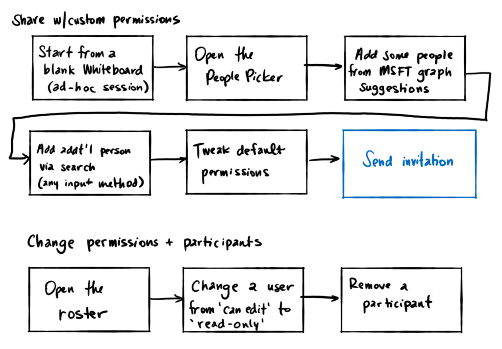
The “master flow” for the Whiteboard Invitation experience. If users could accomplish all of these tasks, we had a successful design.
I tested this master flow as a coded prototype with 12 participants (this time including both IWs and teachers) over the course of 2 weeks, making some adjustments in between. The success rate was near 100% – a huge improvement over the initial sharing URL design. Everyone was able to identify how to start the invitation flow, find the participants they were looking for, adjust permissions, and send the invitations.
A user test in progress.
The recipients of the invitation would receive an email with a thumbnail of the Whiteboard and a button to join the session. Tapping the button would open the Whiteboard in their local client or on the web (depending on what they had installed).
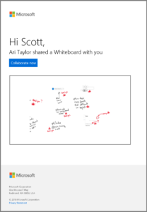
An example of an email invitation.
Final iterations and interaction details
At this point, I was satisfied with the user testing results and received some help from our intrepid visual designers. Up to and during the engineering phase, we continued to polish the visuals, motion, and some interaction details. As a new visual system was coming for right-hand panes in the Windows and Surface Hub versions of the app, we adjusted the design to fit.
PC
I’ve included a gallery of all of the steps of the PC experience with some details in the captions. Click on an image for more detail.
-
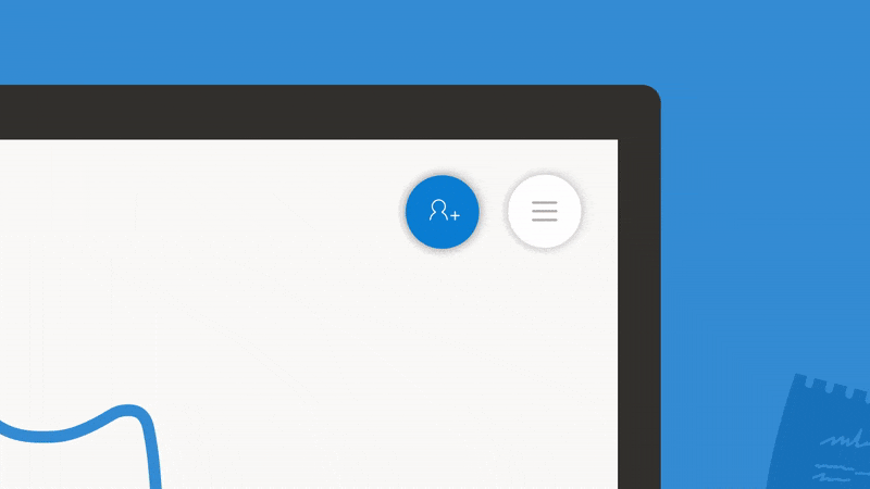
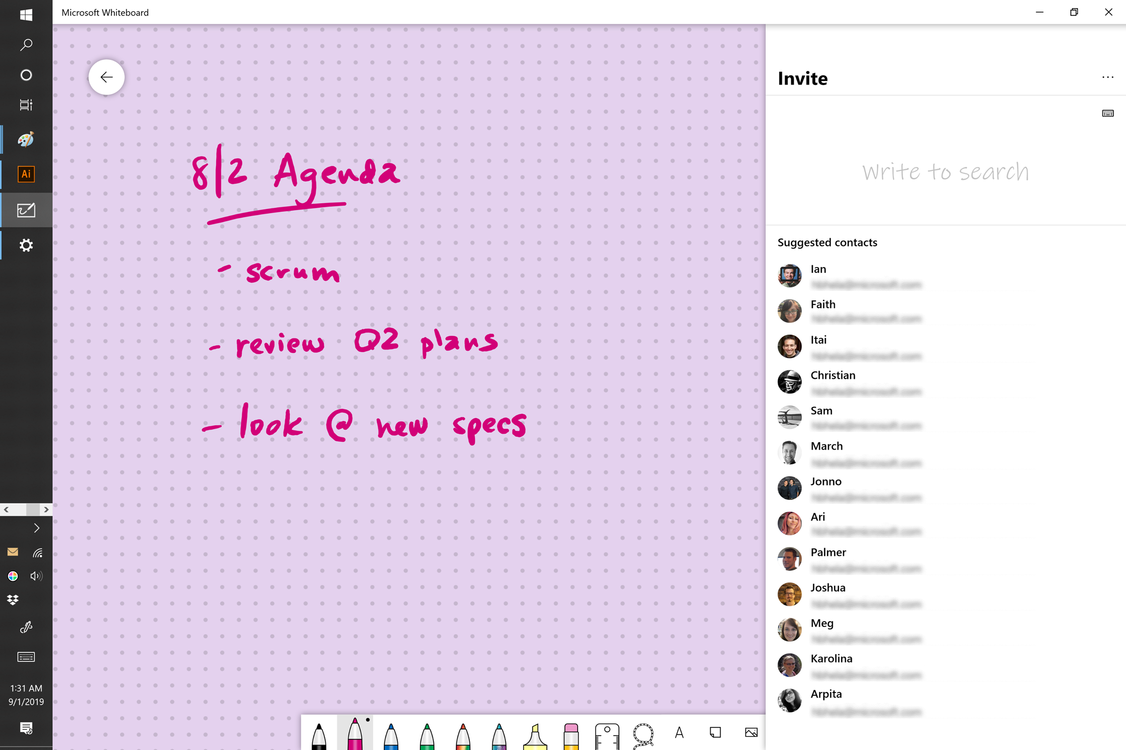
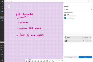
- On every Whiteboard, there’s a colorful share icon in the top right. Clicking or tapping it shows the Invite pane.
-
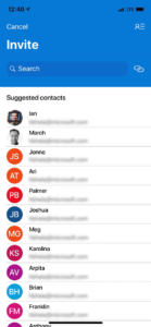
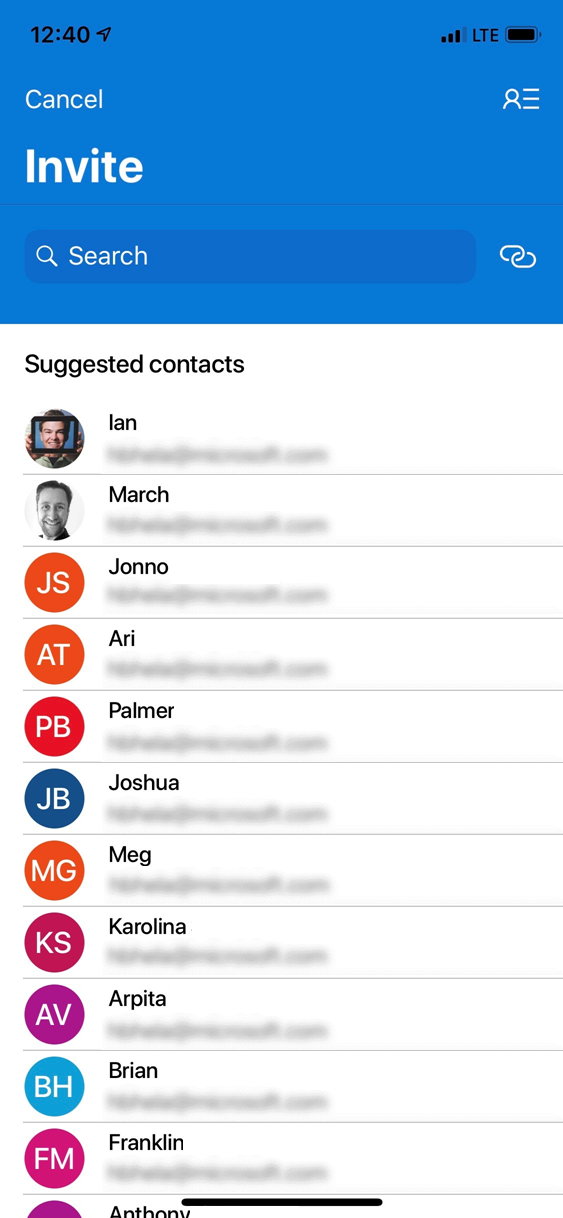
- The invite pane is filled with suggestions. These can be people with whom I frequently collaborate or meetings I’ve been invited to. I’ll start by inviting Ian.
-
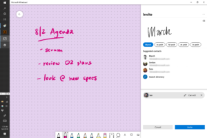
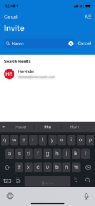
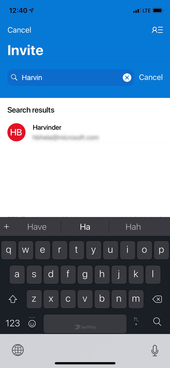
- I can also search for additional people to invite if I don’t immediately see them in the suggestions. Here I will search for March by using my Surface Pen.

-
- Typing works too. I will search for and select Faith.

-
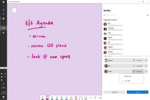
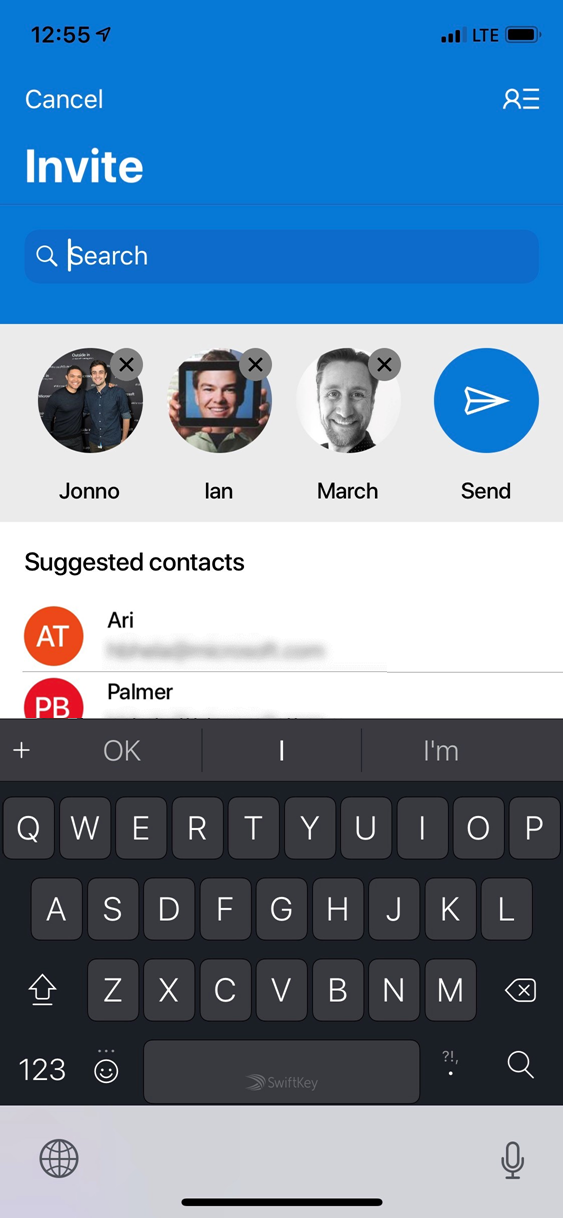
- I can make adjustments to users’ permissions before clicking Invite.

-
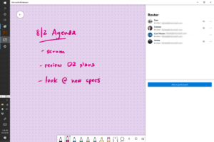
- And once I’ve clicked the Invite button, I’m brought to the Roster as confirmation that I’ve invited all of the people I meant to.

-

- If I notice that I accidentally gave someone edit permissions, I can change it here.

-
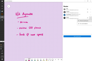
- Or I can kick them altogether.

-
- Once the pane is closed, the sharing indicator shows that there are invitees, but they aren’t currently active. When the come online, their faces will appear.
-
- If I would like to invite participants using a different method, there’s an affordance for that too.

-
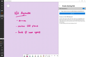
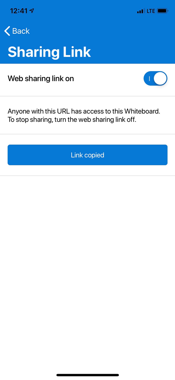
- Here is the Sharing URL flow I started with, hiding a little deeper in the Invite pane. It will be the only option available to users who are not a member of an Organization or who’s administrator has particularly stringent security settings.
Phone
With some help from a visual designer, I adapted the experience for mobile devices – the mobile app retained the same basic flow as its large screen counterpart, but several elements were adjusted and re-arranged to make the pane fit properly on a small, portrait device.
We removed the ability to search with pen and instead opted for just a text box. It felt more natural considering limited input options on most phone.
All of the basic sharing options are available here. Editing individual user permissions is planned but hasn’t yet shipped on iPhone.
-
- After tapping the blue invite button, users are presented with suggestions.
-
- Users may also type to search for additional participants. The name will autocomplete and find matches in the Microsoft Graph.
-

- As each user is added, they appear in a pending list at the top of the dialog. Adjustments can be made before pressing Send.
-

- After sending invitations, invited users will appear in the roster. From here, they can be removed. Ability to edit individual permissions is coming soon to iPhone.

-

- For users that are not part of an organization, the fallback option is the Sharing URL. Users in an organization may also use this option, but it’s not part of the golden path.
Surface Hub
The Surface Hub design had the most difficulties, simply because most of the time it’s running in an “anonymous” state. The flow seen in the above cases still works here assuming the user is logged in, but in a lot of cases that’s just not true. Every time a meeting ends or the device is inactive for a period of time, the OS wipes the entire thing clean for privacy and security. It’s a good security measure, but it means that someone needs to log into the Surface Hub to be able to permanently store content. And that is a time consuming process. Even if there’s a meeting scheduled in the room with the Surface Hub, it’s tricky to find permanent storage for the Whiteboard when there’s no user logged into the device on which it’s being created.
We ended up breaking this anonymous case into its own, smaller feature. Eventually, we found a way to use the Surface Hub resource account to temporarily store the newly created Whiteboard and then subsequently invite additional people using the common collab flow. There are still some tweaks to this design I’d like to implement – the messaging is a bit off as you’re not just inviting other, but you’re also saving the content for yourself for use when you get back to your desk.
Since the Surface Hub is the creator and owner of the content, a system administrator has some extra control around what’s allowed. That means that in some cases, sign in will simply be required to collaborate on the Hub, but in the majority of cases, the experience is really magical. Especially if you have a scheduled meeting.
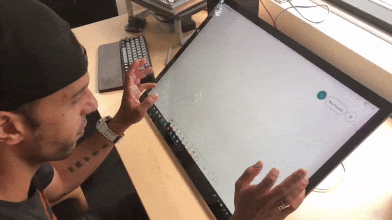
Below is a gif of a user joining a Teams meeting on the Hub, inviting the attendees of the meeting, another suggested participant, and searching for and adding another user with a Surface Pen. All within a few seconds!
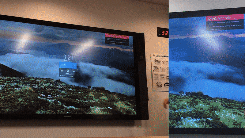
The released version of the collab flow running on a Surface Hub
Outcome
The collab flow has now shipped for all devices, including the anonymous flow for Surface Hubs (for those organizations whose privacy settings allow it). We continue to hear positive feedback from our customers and our team uses it daily at work 🙂
We have lots of metrics around how people are collaborating in Whiteboard since the implementation of this project. Unfortunately, specific metrics are under NDA, but I can say that the collab flow has greatly increased our numbers around engagement and engaged customers. More users sharing means more users trying the app and creating Whiteboards of their own. Any feedback we previously had about people wanted to share as an email attachment has stopped and instead people are asking about additional share targets from the Invite pane.