MENU

Microsoft Whiteboard – overview
I served as a Senior Designer and lead on the Product Design team for Microsoft Whiteboard from 2016-2019.  I also served as a manager on the team during 2019. Product concept In mid 2015, I was part of a small team of OneNote folks asked to envision, build, and test a new type of product for Microsoft, designed to be used primarily on Surface Hub for multi-input collaboration.   Needless to say, this was a seriously exciting opportunity – it’s not every day that you’re asked to help build a completely new productivity app for Microsoft. Some initial ethnographic research had been done before the project kicked off, and we knew that there was a gap for meeting collaboration around freeform input, particularly for remote participants.  Physical whiteboards were (and continue to be) essential for lots of types of in-person collaboration, but there wasn’t a good digital equivalent that could allow remote participants to join in.  And physical whiteboards have lots of limitations – they can’t be shared and are restricted to drawings.  A digital evolution of this medium could allow a new level of collaboration for IWs, classrooms, and even home users. Opportunity statement Collaboration during meetings can be difficult […]
Read More ›

Microsoft Whiteboard collaboration experience
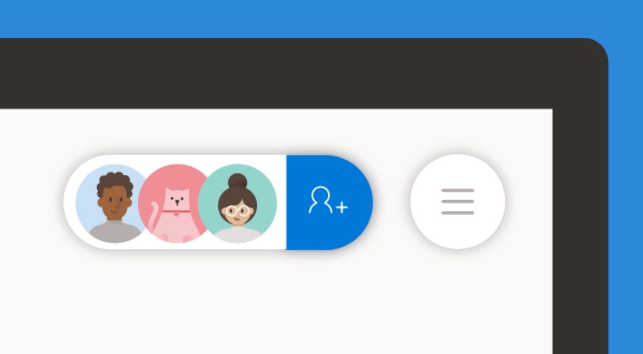
Microsoft Whiteboard is a real-time collaborative, free-form canvas that I helped create. This is a vignette of one of Whiteboard’s major components. For more information on Whiteboard as a whole, as well as other major aspects that I designed, see my Whiteboard overview page. It was challenging to build a collaboration experience for a brand new product.  It was core to our value prop and had to work for all platforms, screen sizes, and types of users. We knew from the inception of the product that we wanted Microsoft Whiteboard to be inherently collaborative. “Collaboration first” was the first design principle and the Surface Hub (where many users would first be introduced to Whiteboard) was a device aimed at making teams work together more effectively. While the engineering team was working on building out the real-time sync engine, I was busy designing the “people picker” & “claim board” experiences as well as storage and user permissions model. My role I was a design lead and manager on the Whiteboard team.  For this product area, I was the designer of the sharing UX including the invite flow and messaging, claim board experience for Surface Hub, as well as permissions, and storage. […]
Read More ›

Reactboard – an experiment with Reactjs
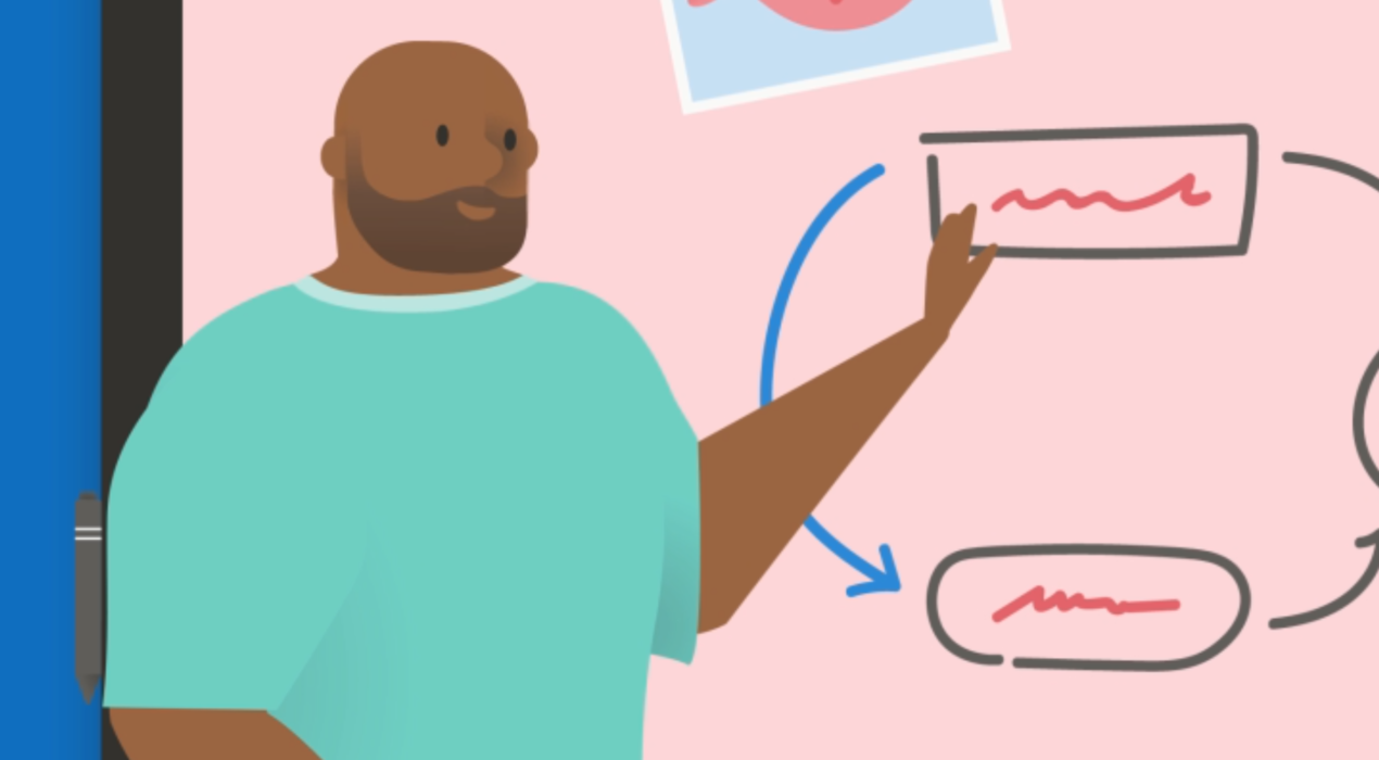
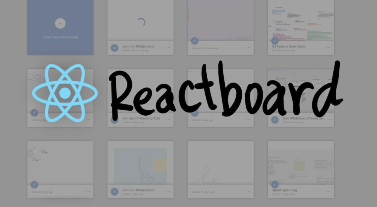
Microsoft Whiteboard is a real-time collaborative, free-form canvas that I helped create.  For more information on Whiteboard as a whole, as well as other major aspects that I designed, see my Whiteboard overview page. Reactboard was a 2019 Microsoft Hackathon project.  2 service engineers, another designer, an intern, and I set out to see how much of Whiteboard we could re-create using Reactjs and other Microsoft components.  I use Reactjs a ton in my side project so I was excited to use what I’d learned outside of work in a Microsoft context.  This was a huge prototyping project that was a great success.  See the video for more details.
Read More ›

Surface Hub & Whiteboard how-to videos
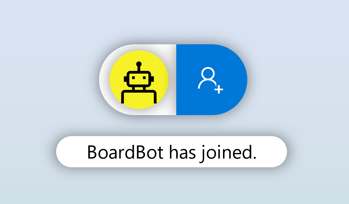
Microsoft Whiteboard is a real-time collaborative, free-form canvas that I helped create. This is a vignette of one of Whiteboard’s major components. For more information on Whiteboard as a whole, as well as other major aspects that I designed, see my Whiteboard overview page. My team and I worked together to make these incredible Surface Hub informational/instructional videos.  One illustrator and one motion designer did the visuals. I wrote the scripts, wrote/recorded/performed the music, performed/recorded the voiceovers, and did the project management.  These came out so well!  I'm really proud of what we could accomplish 😉 Pen and touchCollaborate in real-timeInsert objects
Read More ›

Microsoft Whiteboard in-app teaching

Microsoft Whiteboard is a real-time collaborative, free-form canvas that I helped create. This is a vignette of one of Whiteboard’s major components. For more information on Whiteboard as a whole, as well as other major aspects that I designed, see my Whiteboard overview page. When we released the early versions of Microsoft Whiteboard, we knew we'd built an easy-to-use app, but we were also introducing a huge audience to a relatively new category of software: an always connected and collaborative canvas where keyboard/mouse were not the primary input methods and the artifact was not a file attachment.

Problem

Several of the features in Whiteboard weren't as self-explanatory as we would have liked.  A few too many new concepts were introduced at once and some users were missing key aspects of the value prop.

User research

Over a period of a few months, we brought lots of users in for weekly user testing to observe their behaviors and how they were successful (or not) in using Microsoft Whiteboard.  We found a few particularly interesting things:
  • When presented with a digital stylus (like a Surface Pen), the tool was so arcane that many didn't know how to use it: draw directly on the screen, flip the pen over to erase, hold the button for Lasso select, and rest your palm on the screen
  • Our goal was to have every Whiteboard be a collaborative Whiteboard, but even with an FRE, marketing messaging around this concept, and a highly prioritized collaboration experience, many users didn't have the expectation that their Whiteboards were shareable
  • When presented with a touch screen, a mouse, and a pen, users weren't sure which device to use for which task
 

Initial explorations

Video: Triggered callouts appear when the user has or hasn't taken some action over a period of time.


So we implemented a set of basic triggered callouts.  These guide the user over a period much longer than the typical First Run Experience. It was an early attempt to address the bullets above.

When triggered callouts like these first started appearing in applications, they did quite well in grabbing users' attention and teaching them what they needed to know.  But over time, their prevalence made them more commonplace, less noticeable, and less effective. Since the implementation of the triggered callouts, I've done several explorations around guiding the user through the app like in the beginning of a video game.  A few primary tasks with an AI recognizing their accomplishment.  

Further explorations

Video: "BoardBot" was an exploration around a digital companion teaching the user about Whiteboard.

  BoardBot was one attempt at guiding the user through some simple steps.  But it also quietly expressed that others could pop in and out of Whiteboards.  With BoardBot we're able to show the collaboration aspects of the app from the user's first time interacting one the canvas.  

Status

Triggered callouts have been released in Whiteboard for some time with some success.  Explorations such as BoardBot are still ongoing.
Read More ›

Microsoft Whiteboard snapping prototype

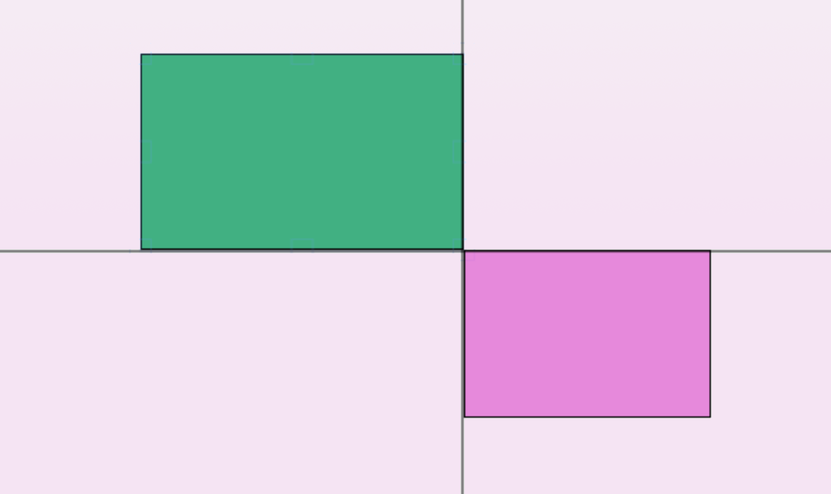
In 2019 I worked on a new feature for Microsoft Whiteboard that would enable a variety of different snapping behaviors on the canvas.  Since there were a lot of variables that were difficult to "feel" without having them implemented, I took a day to quickly mock up a prototype in Javascript that would help us get a feel for these different types of snapping and good default values. Take a look at the video below to see more details on this prototype:
Read More ›